In the initial stages of the project, I embarked on a journey of self-discovery. Through introspection and market research, I defined the brand by its core values, mission, tone of voice etc.
The goal was to create a brand that authentically reflects my passion for psychology, art and design while resonating with a target audience who seeks inspiration and support in creating their identity.
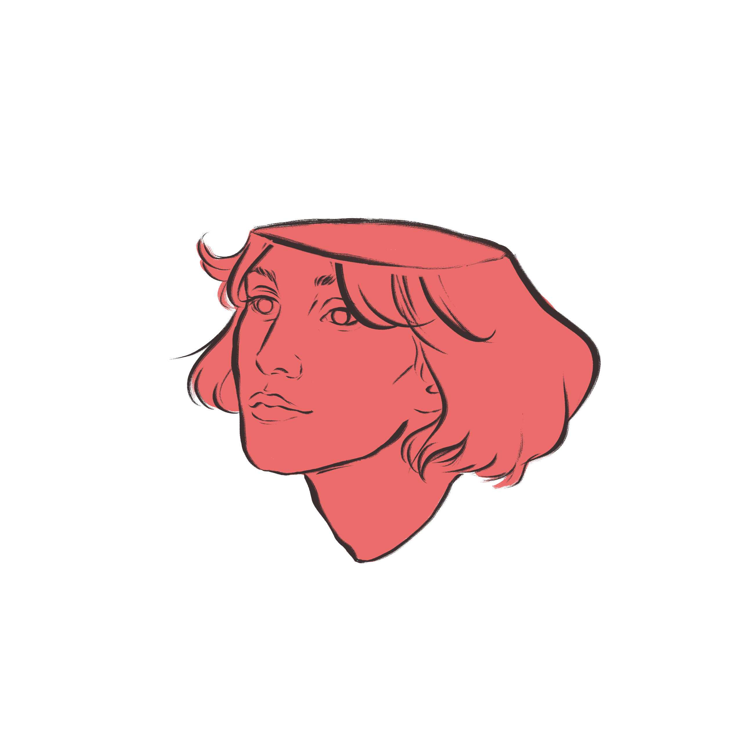
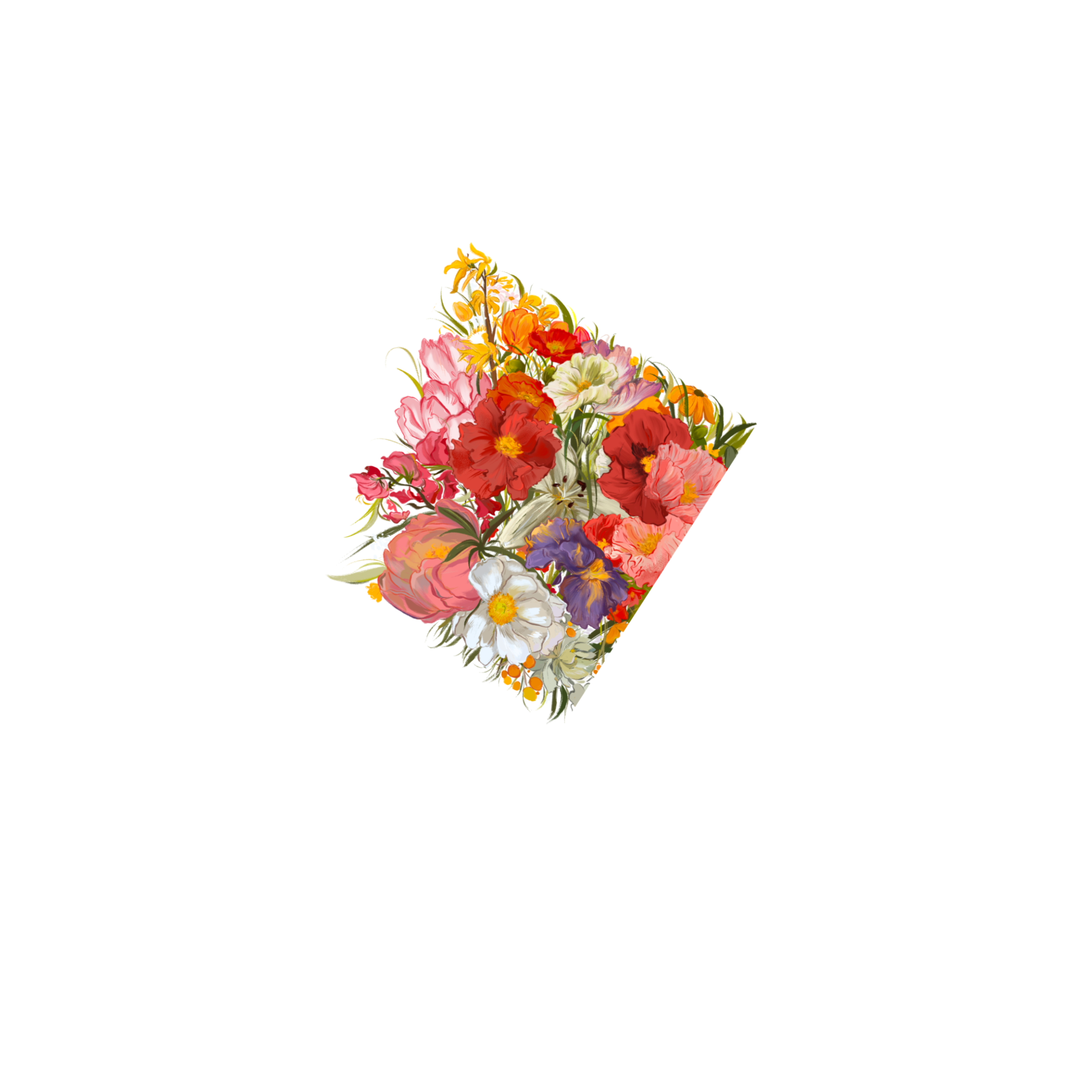
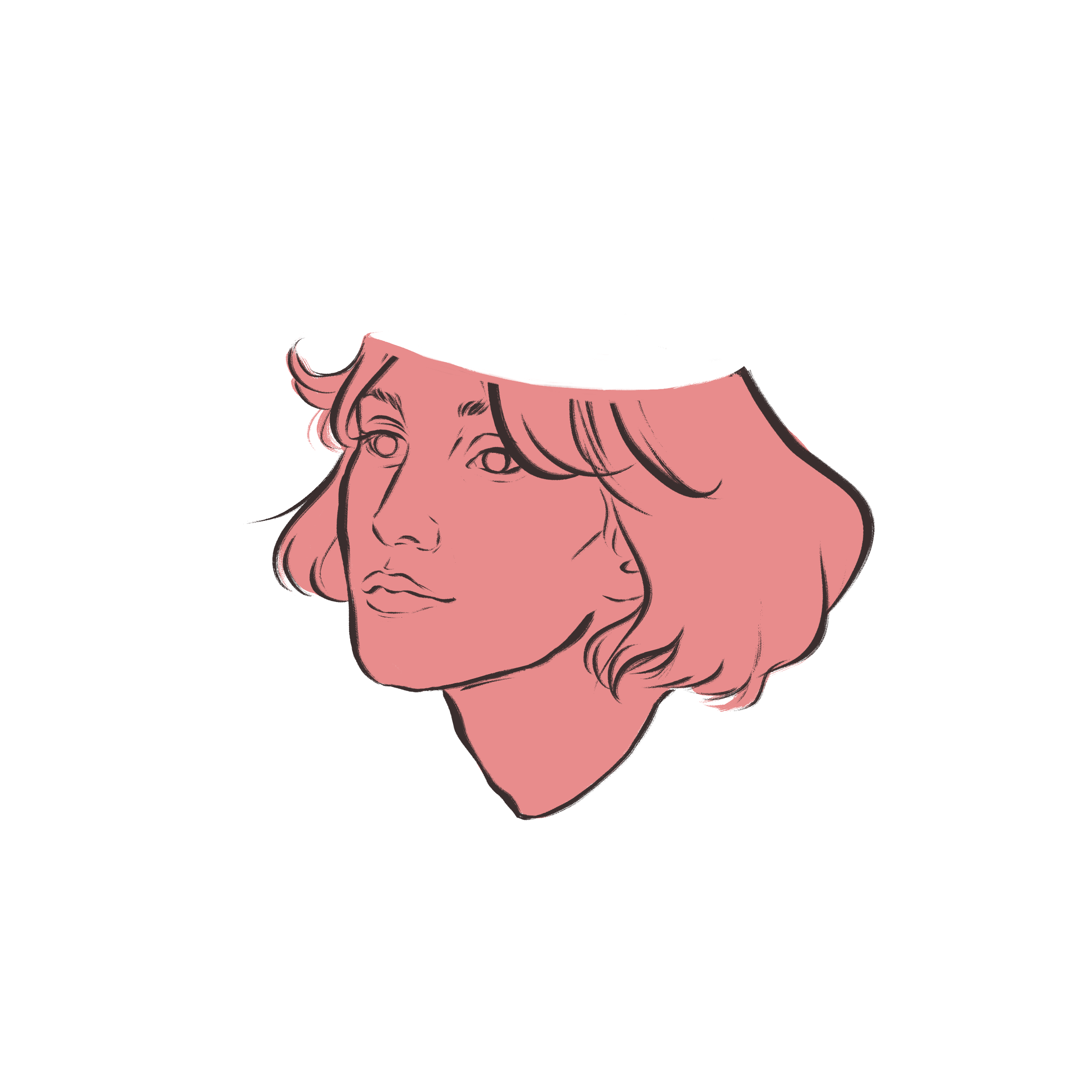

When I understood what I what to represent and whom I’d like to work with, I developed a comprehensive brand strategy.
I often use Jung-inspired brand archetypes as guidance. The Lover archetype was chosen deliberately, as it perfectly aligned with the desire to evoke emotions, build connections, and create immersive experiences. Add a bit of The Creator archetype and voilà! That’s me!
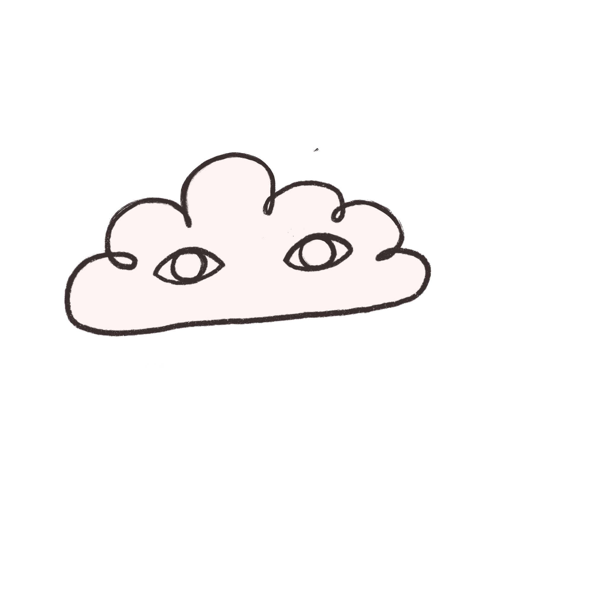
I crafted a unique, hand-drawn logo that featured a whimsical illustration. The cloud represents my dreamy nature, her eyes wide open allow for observing and recognize the omnipresent beauty.
The color palette incorporated shades of warm pastels and vibrant accents, infusing the brand with a sense of positivity and approachability. As for typography, I aimed for a playful yet sophisticated feel.

I think about an online portfolio as an opportunity to showcase my style and creativity. Understanding the importance of a compelling online presence, I designed the website to let visitors explore my creative process. I wanted the audience to feel connected and invited to my inner world.
As I wanted everyone to enjoy the experience, I paid attention to accessibility issues such as color contrast, readable typography, button size, alt image descriptions etc.
