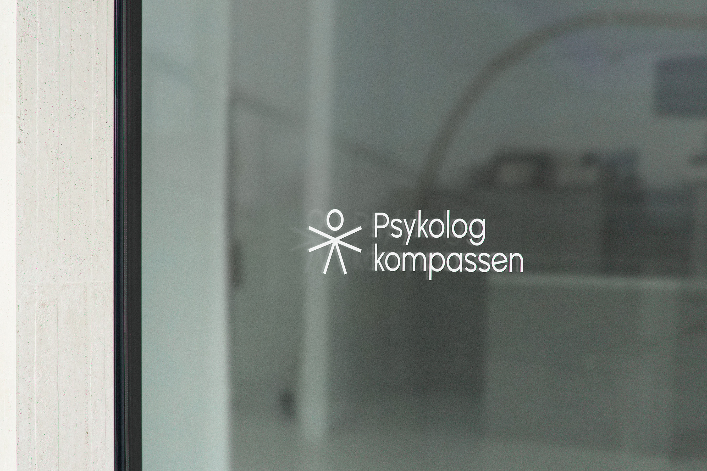
- Logotype design
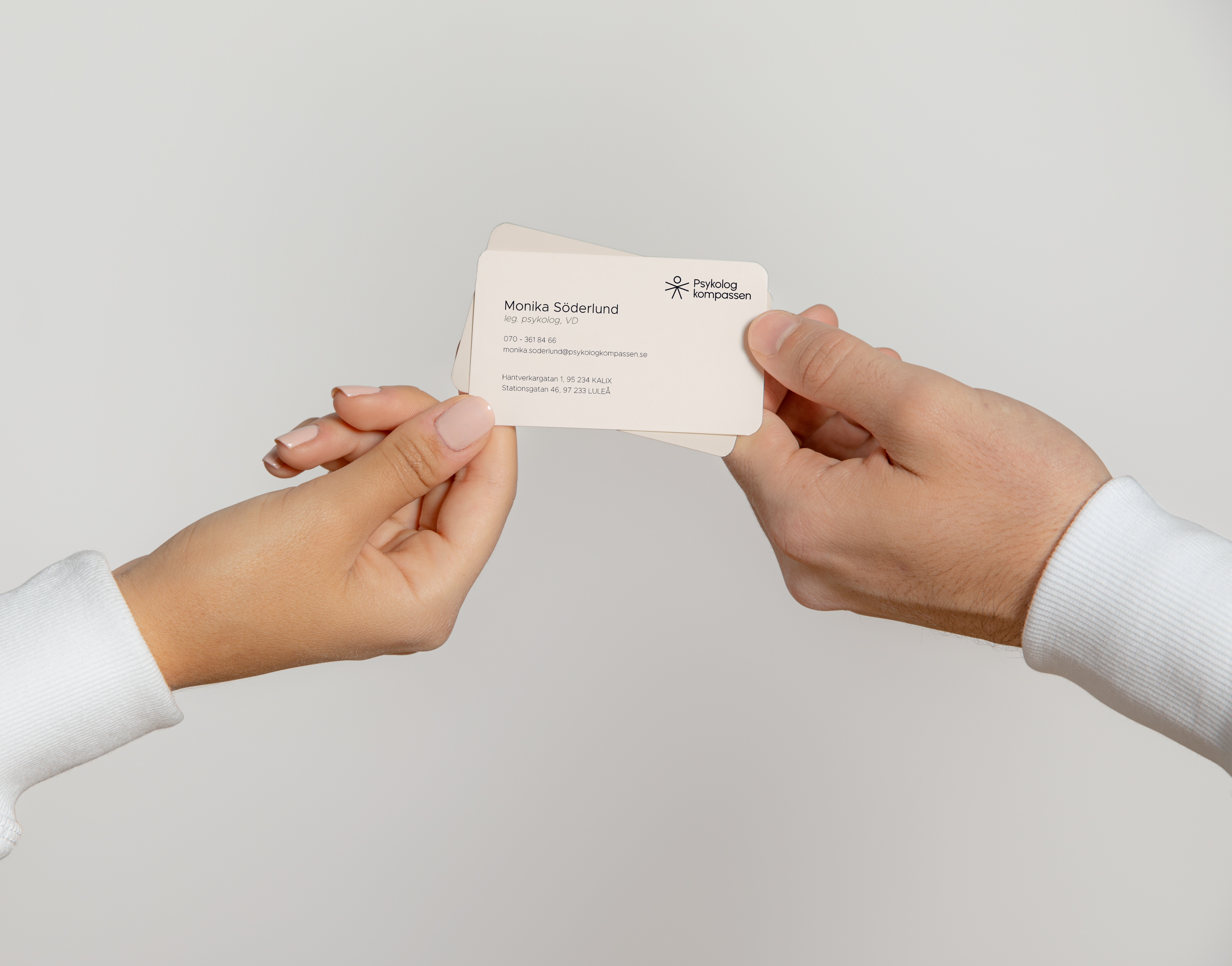
- Brand identity
The name of the company derives from the psychological need for an inner compass. In order to feel satisfied and fulfilled, humans need to have a purpose. It can guide and support them, especially when they need to decide which road to take in their life journey.
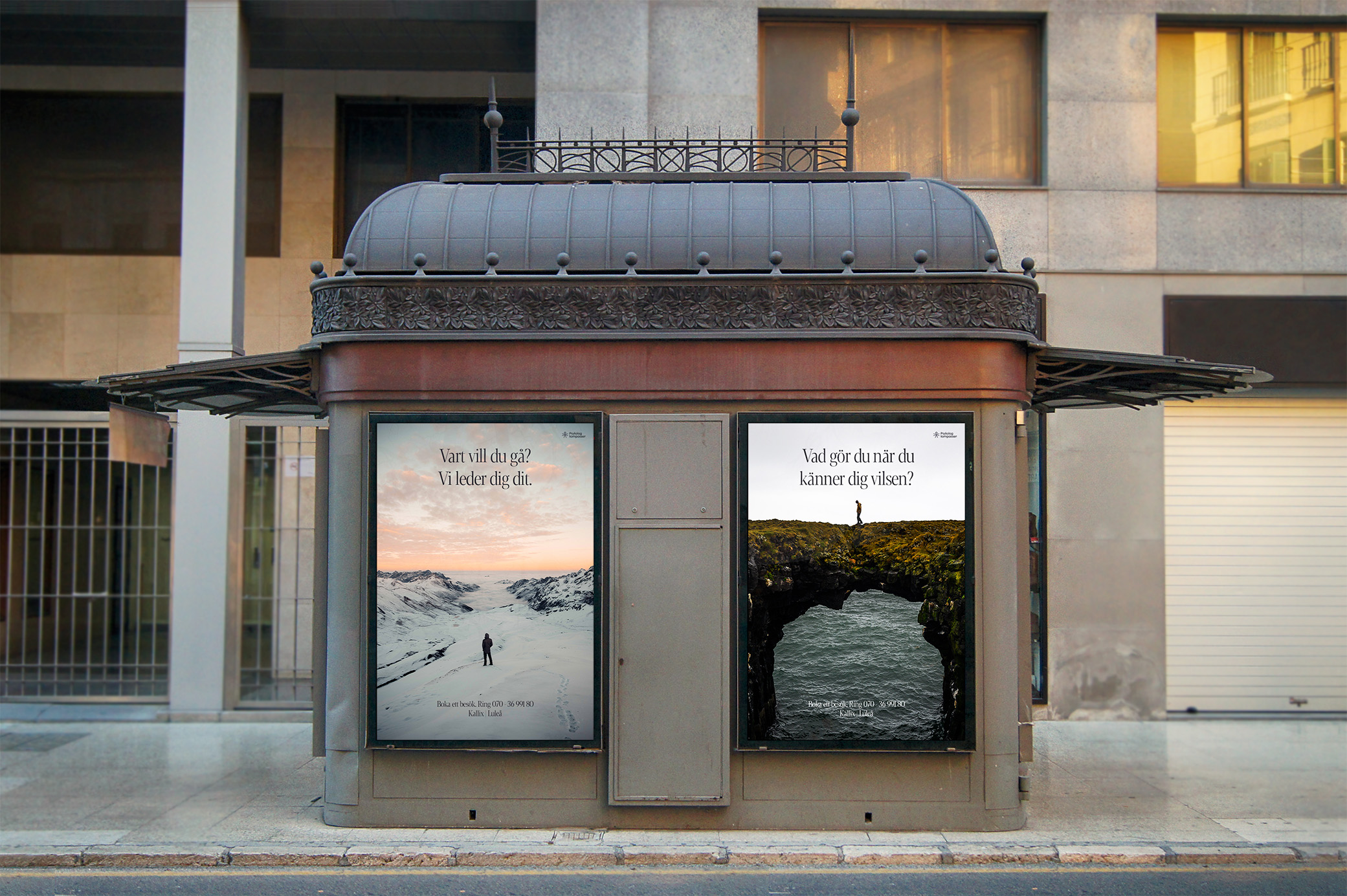
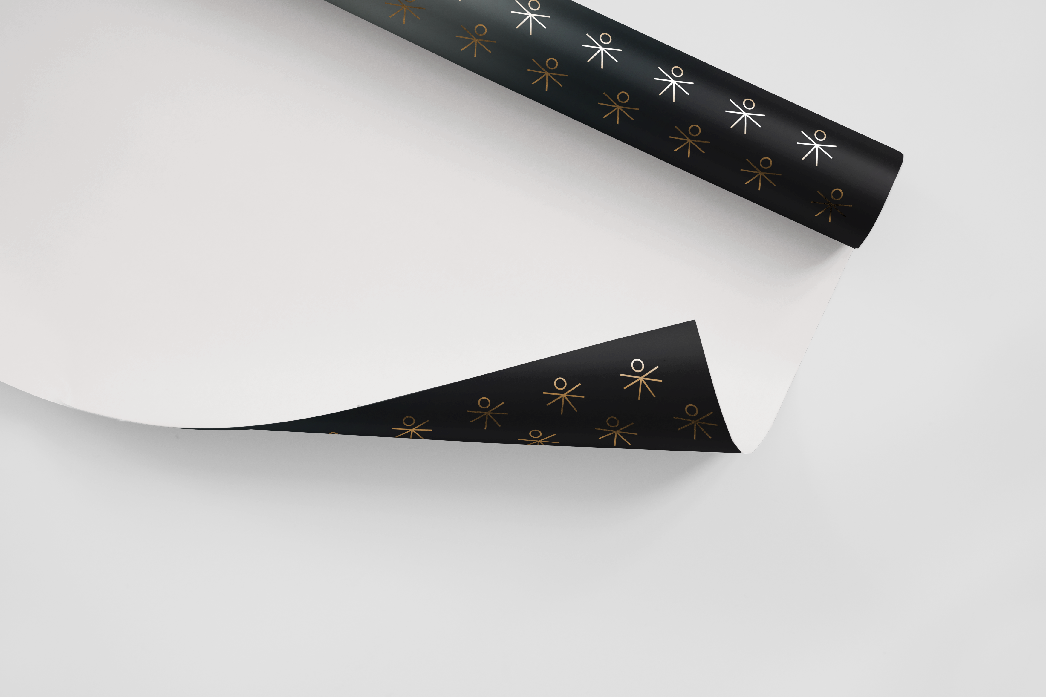
Psykologkompassen's name itself resonates with the very essence of purpose – that magnetic pull that draws us towards fulfillment. We intertwined this concept into every visual element, so clients could feel the North Star of purpose in every interaction.
The visual communication is connected with the name behind meaning and corresponds with the beauty of North Swedish nature. Each visual element tells a tale of discovery, mirroring the journey of those seeking direction amidst life's vast landscape. I wanted to tell a story of a person seeking a right pathway for themselves, finding a way in life and embracing the process.
Our branding was a catalyst, turning a mere company into a compass that points to purpose. Clients aren't just customers; they're explorers, and Psykologkompassen is their trusted guide.
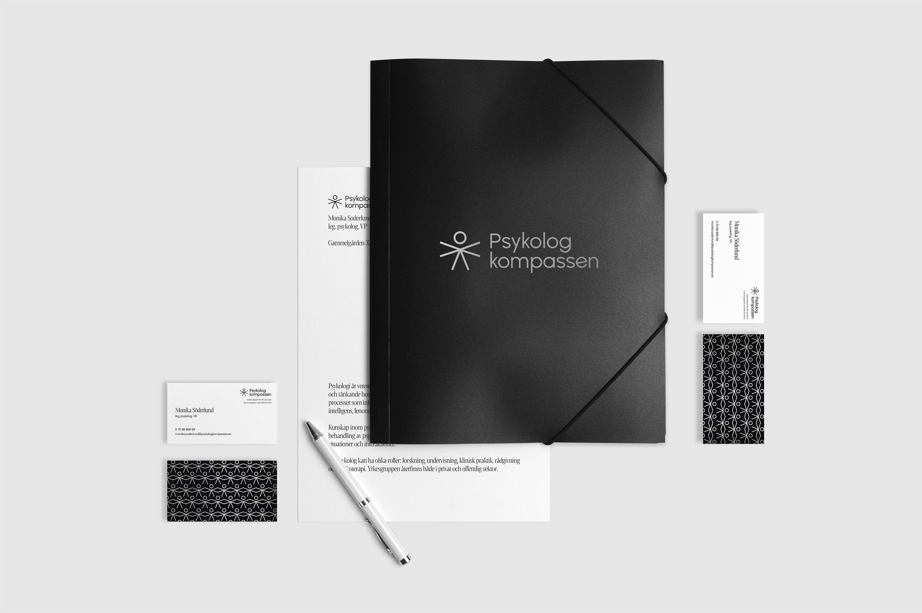
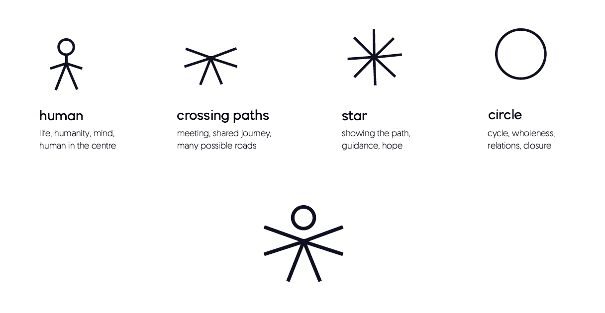
It has been a great pleasure and very inspiring to hire Aleksandra. She has listened, asked and listened again. She has created a logo that I am happy and proud of. A unique logo - a symbol that tells what my company stands for. I can warmly recommend her.
