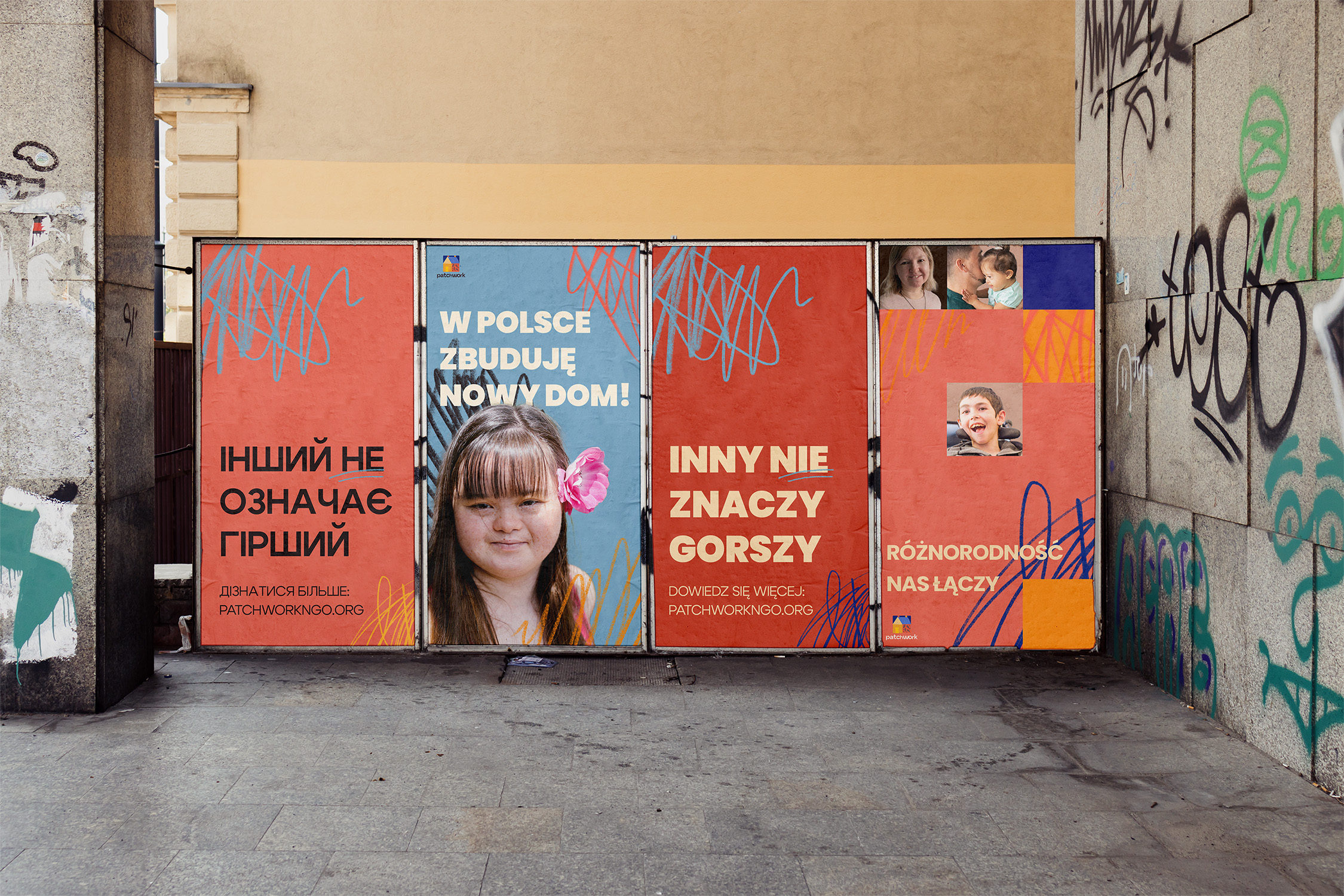
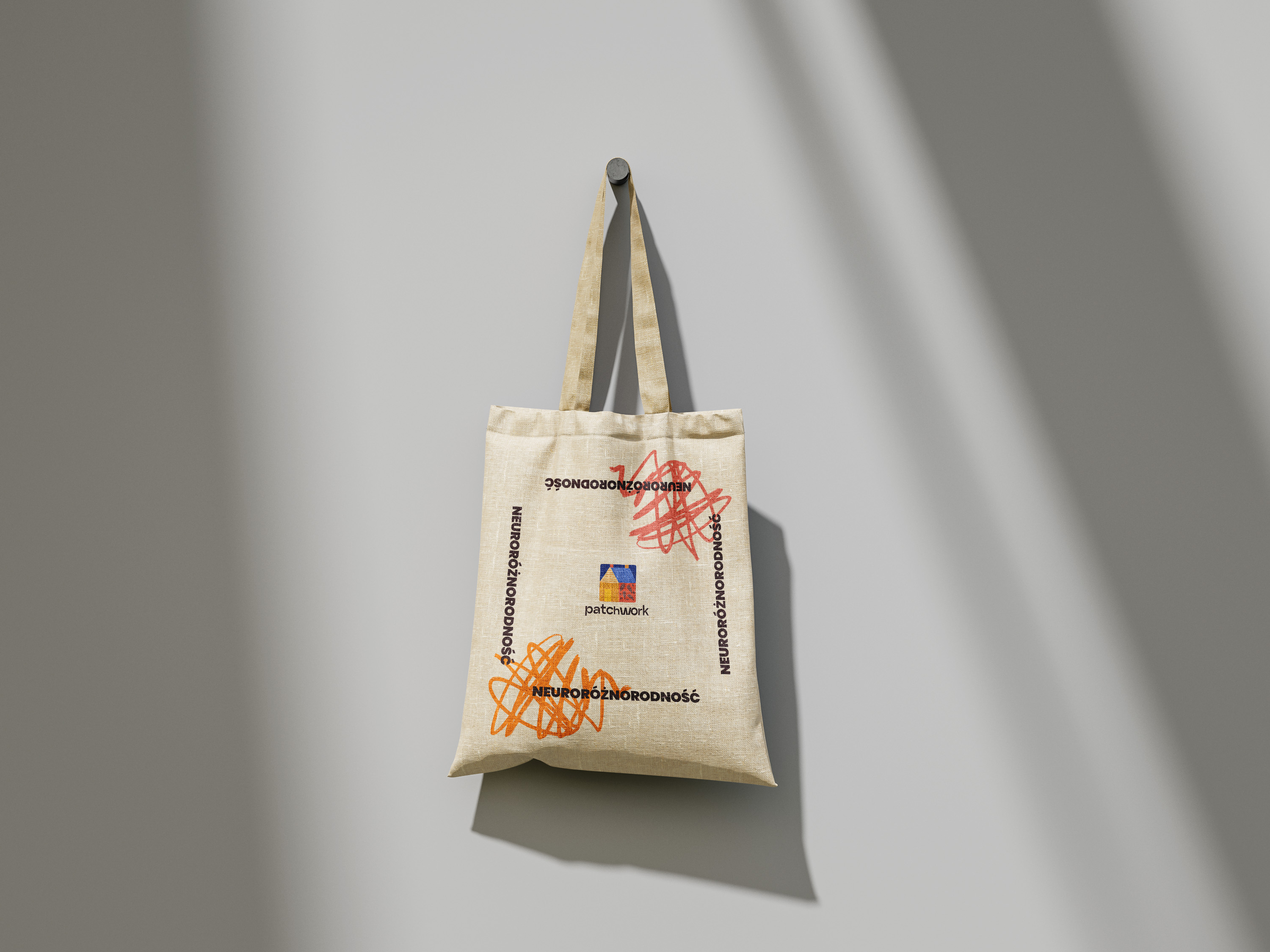
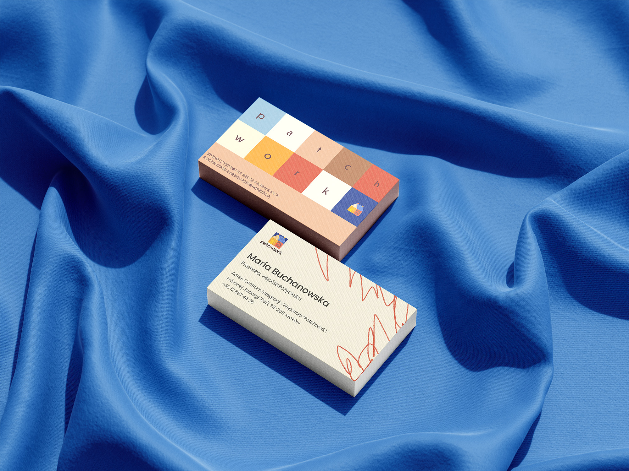
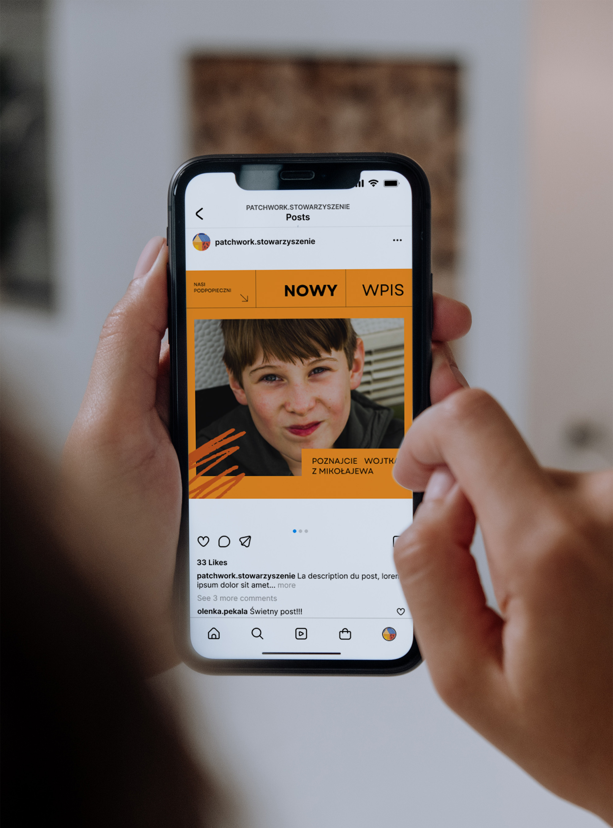
- Brand identity
Patchwork, an association for immigrant families of people with disabilities, embodies unity in diversity. Its name reflects the fusion of diverse experiences into something unique, capturing their serious, heartfelt work without unnecessary pathos.
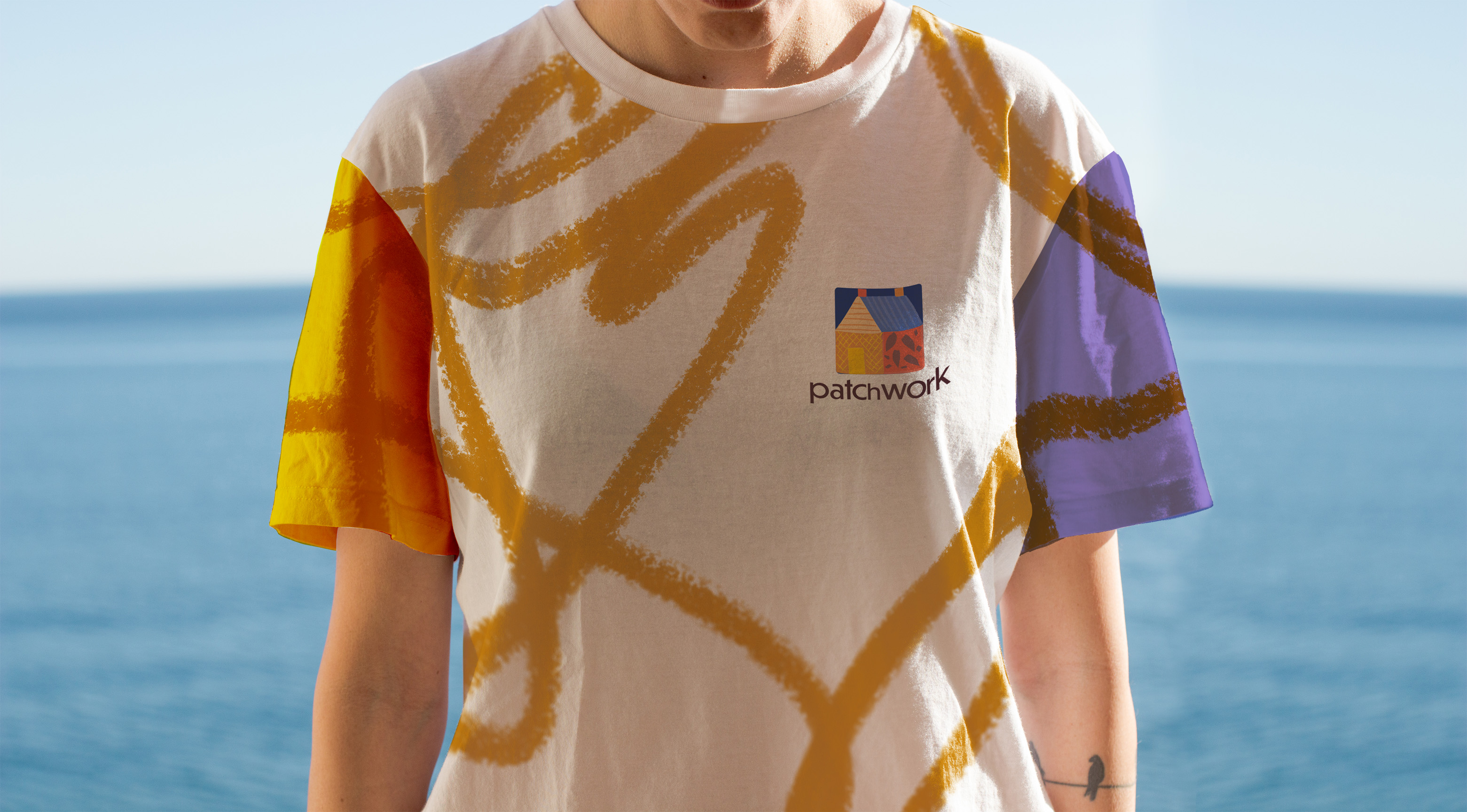
The color palette reflects their values - beige signifies equality and harmony, while warm reds and oranges emanate fervor and support. Blues represent professionalism, reliability, and unwavering commitment. Accessibility was paramount here; the chosen typography ensures maximum readability, available in both Latin and Cyrillic characters for effective communication within their diverse community.
Patchwork's members spirit, despite facing dramatic challenges like fleeing the war in Ukraine, radiates hope and resilience. Patchwork stitches unity and positivity into its vibrant tapestry, a beacon of inspiration amidst life's trials.

Aleksandra was both creative, and very attentive to our needs. We are satisfied with the work Aleksandra did for us - she is a talented designer, which we can highly recommend!